Textiles · Explainer · 3 min ·
How do you mix patterns without chaos? Change the scale and see
Why do some patterns look calm together while others fight? It comes down to three plain things: how big each print is, how many colours they share, and whether the eye has somewhere plain to rest.
Build a sofa scene with a rug, a throw and cushions, change each pattern and its scale, and watch a calm score react. Includes the 60/30/10 rule of thumb, ideas for trying prints with textiles you already own, and when to ignore the rules.
Why some patterns get along and others fight
Put a striped cushion on a checked throw and the room either looks put together or looks like a jumble sale. Rarely is it about taste. It is mostly about three plain things: how big each pattern is, how many colours they share, and whether the eye has somewhere quiet to rest.
Designers and retailers who write about this tend to land on the same few ideas. Mix small, medium and large prints rather than three of the same size. Start with the biggest print on a big piece, such as a rug, a bed or a curtain, and use smaller prints as accents. Keep the palette tight, and balance patterns with plain areas, because solid colours give the eye a place to rest. A popular rule of thumb is a 60/30/10 split: about 60% of one pattern, 30% of a second and 10% of a third.
Try it on a sofa
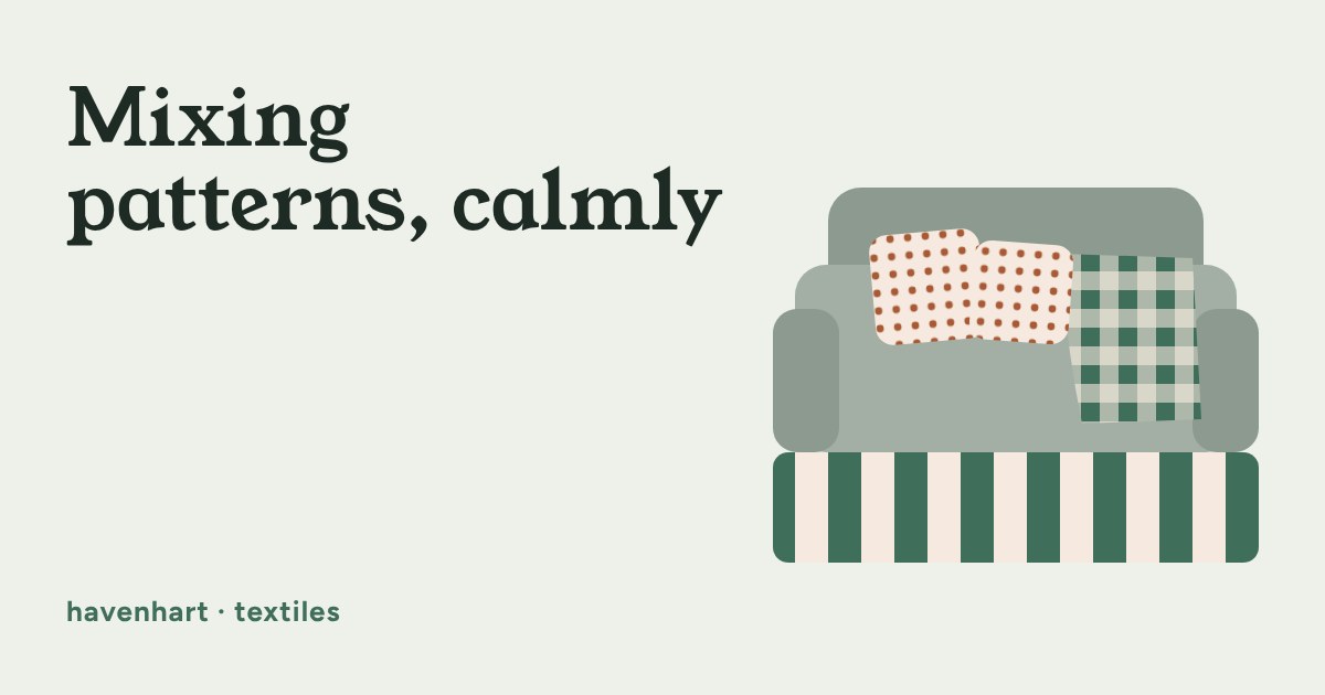
The scene below has three layers: a rug (the big one), a throw (the middle one) and a pair of cushions (the small one). Change each pattern and its scale, switch between one shared palette and mixed colours, and watch the calm score. It is a rule-of-thumb guide, not a verdict: if you love a combination that scores low, keep it.
The three rules, in plain words
Change the scale. Try a big print, a medium one and a small one. Two prints of the same size fight for attention; a big and a small one take turns. In the scene above, drag two sliders to the same spot and watch the score drop.
Share a colour. Prints with different shapes feel related when they pick from the same few colours. You do not need an exact match: two or three colours repeated across the room is enough. Same-size prints can even work if the colours are shared.
Leave plain space. A plain sofa, a plain wall or a solid cushion between busy ones gives the eye somewhere to land. If you are unsure, the 60/30/10 idea helps: one pattern does most of the work, a second supports it, and a third is only a little accent.
Using what you already have
You rarely need to buy anything to try this. Swap a cushion cover with the next room, fold a throw the other way round, or turn a patterned one inside out to see its plain side. Second-hand covers and throws are a cheap way to test a new print before committing to a bigger piece. If you rent, textiles are the easy place to play, because everything can come back off.
When to break the rule
If a mix makes you smile, it works for you. Rules like these are for the moment you stand in a shop holding two things and cannot decide. Collected, slightly mismatched rooms can look lovely, and a low score here only means the layers will compete a bit more, not that you got it wrong. If you do buy a new rug, curtain or large throw, measure the space first (the floor area for a rug, the window width and drop for curtains, the sofa or bed width for a throw) so the biggest piece fits before you build the rest around it.