Lighting · Explainer · 4 min ·
Why do colours look dull under some bulbs? Slide the CRI and see
Why does a cushion that looked rich and warm in the shop turn dull under your lamp? Often it is the bulb's colour rendering index, or CRI: how faithfully a light shows colours, which is a different thing from how warm it looks.
Slide the CRI and watch terracotta, sage, oak, navy and rose drift away from their daylight colours. The guide explains what the score means, when 80 is plenty and 90 or more helps, and how to test a bulb at home before you spend anything.
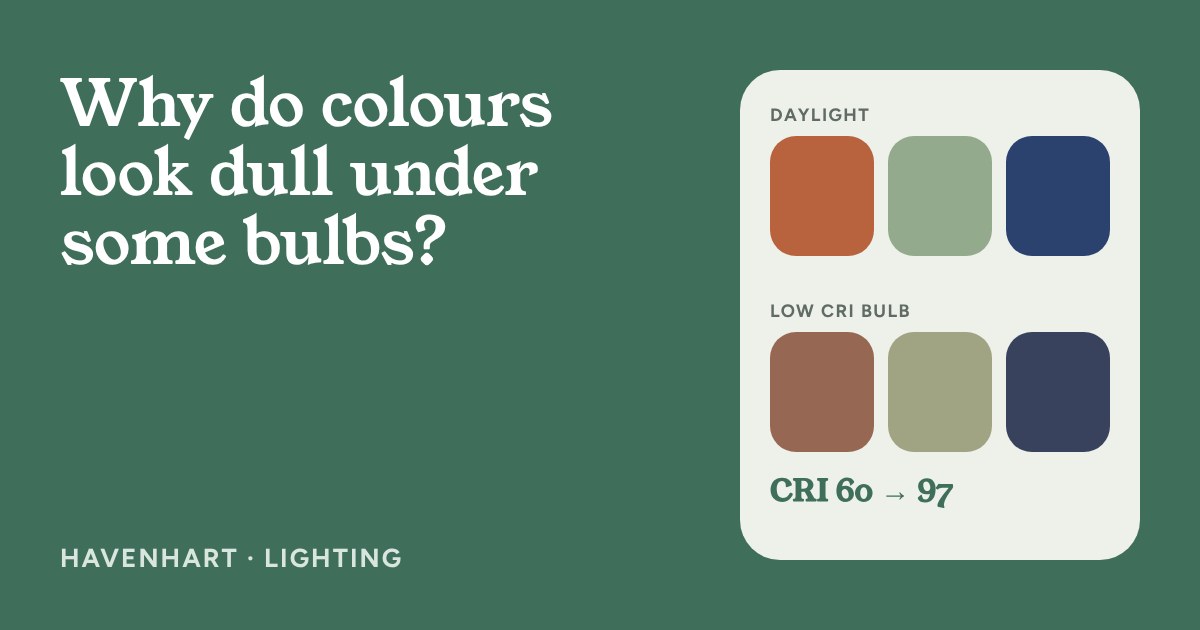
You bring home a terracotta cushion that looked warm and rich in the shop, and under your living room lamp it turns dull and brownish. Nothing is wrong with the cushion. The bulb is the difference, and the number that describes it is the colour rendering index, or CRI.
What CRI actually measures
Kelvin tells you whether light looks warm or cool. CRI tells you something else: how faithfully the light shows colours. Two bulbs can both be a cosy 2700 K and still make your sofa look different.
The score runs up to 100. To get it, a lab compares the bulb with a reference light of the same warmth, such as daylight or a glowing filament, and checks how eight standard colour samples shift. The average of those eight is the Ra figure printed on many boxes. Roughly, 80–90 is considered good for everyday rooms and 90 and above is very good. EU rules for lamps sold from 2021 set 80 as the minimum for most home bulbs, so a bulb in a normal shop is very unlikely to be far below that.
Why it matters in a cosy room
Warm, saturated colours are where a low-CRI bulb shows first: terracotta, rust, rose, deep greens, natural wood and skin. A bulb that gives them a flat, greyish look makes a room feel less welcoming, even if the brightness and warmth are right. This is why a lamp can seem fine on its own yet make your furniture look tired.
A high CRI is not a promise of a nice room. It does not change how bright the bulb is or how warm it looks, and it does not fix a harsh position. Treat it as a finishing detail after you have chosen the warmth and brightness.
What the numbers on a box mean
- Ra or CRI 80+ is the baseline for most home LED bulbs, and is fine for most living spaces.
- CRI 90+ is worth looking for where colour matters: next to a mirror, over a dining table, near a sofa you chose for its fabric, or where you hang art.
- R9 is a separate score for saturated red. Some makers print it. If you love warm reds, rust and wood tones, a higher R9 helps, but many boxes do not list it, so do not rule out a bulb only because it is missing.
If the box does not state a CRI at all, the maker's product page or data sheet usually does. When in doubt, a bulb described as "high CRI" or "Ra 90+" is the safer bet, but there is no need to replace working bulbs just to chase a number.
Test it in your own room
You do not need any equipment. Hold the same cushion, fabric swatch or paint sample under daylight by a window, then under your lamp in the evening, and compare. If it looks very different and you notice it, your bulb may be the cause. Do this before you commit to a paint colour or a sofa, since samples are cheap and returns are not.
Try these free fixes first: move the item nearer the lamp, add a second lamp at a different height so the colour is lit from more than one side, and let daylight do its work during the day. Swap a bulb for a higher-CRI one only where it bothers you.
When to break the rule
A hallway, cupboard or spare room does not need top-grade colour. A candlelit corner is a different kind of light and can look lovely whatever any score says. And if you are happy with how your room looks in the evening, a CRI of 80 is already doing its job.
What to look for
At every budget, check three things on the bulb page or box. First, the CRI or Ra, aiming for 80 as a minimum and 90 or more where colour matters. Second, the colour temperature, such as 2700 K for a warm glow. Third, the dimmable mark if you want to use a dimmer, since not every LED bulb works with every dimmer.