Colour & Walls · Explainer · 4 min ·
Why does one white look yellow and another blue? Change the light and see
Every white paint is white plus a hint of another colour, and that hint, its undertone, is why one white looks creamy and another looks cold. Pick a white, slide the light from a warm bulb to cold daylight, and change what sits beside the wall to see how much of the colour comes from the paint and how much from everything around it.
You'll also learn a simple way to test a white at home with a large sample and a sheet of printer paper, so you don't have to guess from a tiny chip.
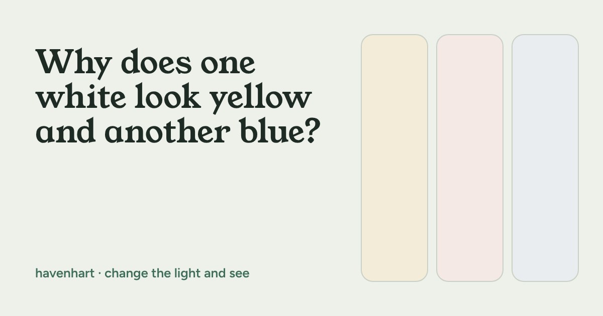
Why does one white look yellow and another look blue?
You hold up two tins that both say "white". One looks creamy, the other looks faintly cold, and neither looks like the printed card in the shop. Nothing is wrong with your eyes. Every white paint is a tiny bit of some other colour mixed into white, and that hidden tint is called its undertone.
Undertones are why a white that was lovely on the tin can look pinker at night or greyer on a north-facing wall. The good news is you can see this happen in thirty seconds, and you don't need to buy anything to do it.
What an undertone actually is
Pure white reflects all the colours of light about equally. Paint makers add small amounts of pigment to white to get softer, more livable shades. A drop of yellow or red-brown gives a warm white. A drop of blue, grey or green-grey gives a cool white. A white with very little tint is closer to neutral, although in a real room almost nothing is perfectly neutral.
On a big wall the tint gets more noticeable, not less. A small sample chip hides it. Three square metres of the same colour does not.
Try it: change the white, the light and the neighbour
The wall below is one white. Next to it is a sheet of plain white paper, lit the same way. That paper is your reference: it shows you what the light itself is doing. Switch the white, slide the light from a warm bulb to cold daylight, and change what sits beside the wall. Colours on screens vary, so treat this as an illustration of the effect, not a colour match for any tin.
Three things change what you see
The light. A warm 2700 K bulb pushes every white towards yellow. Cold daylight from a north-facing window pushes it towards blue. A white that looks right at noon can look quite different at 8pm, and rooms with both kinds of light show both versions in one day.
What's beside it. Your eye never judges a colour alone. A white next to warm wood can look cooler than the same white next to a grey floor. That's why a chip held up in the shop tells you so little about your wall.
How much of it there is. Paint colour looks stronger over a large area. If a white looks very slightly cream on a small sample, expect it to look creamier across the whole wall.
How to pick a white without guessing
- Start with the light. Notice which way your windows face and what bulbs you use. Warm bulbs and a cosy, evening room suit a warm white. A cool, shadowy room often feels calmer with a white that isn't too blue.
- Look at what stays. Floors, a sofa, kitchen units and a rented room's fixed tiles can't change. Choose a white that sits happily with them rather than fighting them.
- Test big. Paint a sample on a large sheet of lining paper or card, roughly the size of a sheet of A2 if you can, and tape it up. You can then move it between walls and look at it in the morning and in the evening.
- Compare with plain white paper. Hold a sheet of printer paper beside your sample. The difference you see is the undertone.
- Look for three days. Weather and time of day both change the result. Give yourself a few days before you commit.
When to break the rule
There is no "correct" undertone. Plenty of calm rooms use a clearly warm white on purpose because it feels soft in the evening, and plenty use a cool white to keep a sunny room fresh. The only mistake is choosing from a tiny chip under shop lighting. If you rent, check what your lease allows before painting, and if you can't repaint, you can still change the feel of the room with warmer bulbs, textiles and where you put the lamps.
What to look for
If you do end up at the paint counter, a few things help at any budget. Ask for a small sample pot rather than deciding from the chip. Check whether the tin or the maker's page lists the colour's light reflectance value (LRV), since a higher number means more light bounced back. And keep the brightness of your bulbs and their colour temperature in mind, because they change the result as much as the paint does.